

Sections & layouts blocks
Page-level structural sections — Hero section, Image and text, Call to action (CTA), and Showcase category
This group contains page-level structural sections — often the most visually impactful parts of a website, such as the top hero banner, intro sections, and call-to-action sections that guide visitors toward an action.
Hero section
A large banner-style section that usually goes at the top of a page. Contains a large heading, an optional subheading, a background image, and a button.
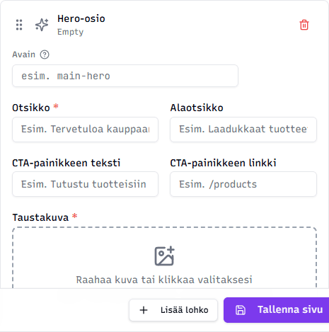
Fields:
- Title (required) — large main heading, e.g. "Welcome to our store"
- Subtitle (optional) — descriptive text below the title
- CTA button text (optional) — e.g. "Browse products"
- CTA button link (optional) — where the button leads, e.g.
/products - Background image (required) — image that covers the entire hero area's background. Recommended: 1920×1080 pixels.
Tip: Pick a background image that also works behind text — avoid images with too much detail in important spots. The main attention belongs to the title.
Image and text
A classic two-column block: image on one side and text on the other. Suitable for introducing a service, story, person, or philosophy.
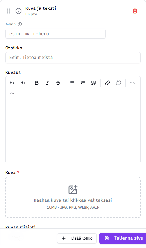
Fields:
- Title (optional)
- Description — rich text (headings, bold, lists, links)
- Image (required) — main image
- Image position — Left or Right (controls whether the image appears on the left or right of the text)
Tip: Alternate the image position when there are several Image and text blocks in a row — left, right, left — so the page feels lively rather than rigid.
Call to action (CTA)
A call to action block guides visitors toward an action. Typically a heading, description, and up to two buttons: the primary button leads to the most important action, and a secondary button offers an alternative.
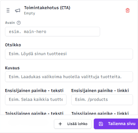
Fields:
- Title (optional)
- Description (optional)
- Primary button — text and link — e.g. "Browse all products" and
/products - Secondary button — text and link — e.g. "Contact us" and
/contact
Tip: Use a CTA at the end of a page, either as a separating section or right before the footer. Visitors usually need a clear "what should I click next" pointer.
Showcase category
Showcases three product categories side by side — each with its own image, title, description, and link to the category page. Suitable for the home page to direct visitors to different product groups.
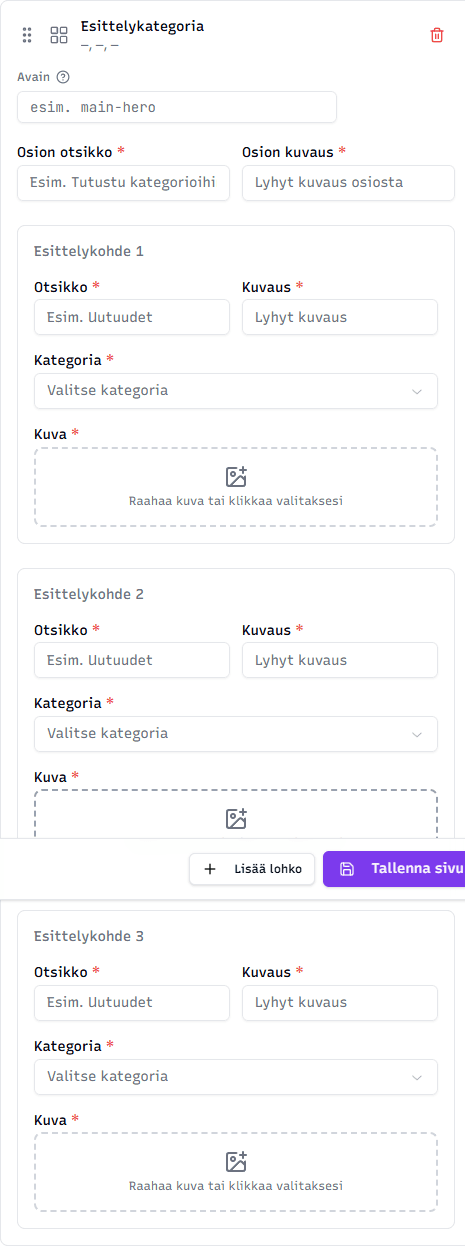
Fields:
- Section title (required) — e.g. "Browse categories"
- Section description (required) — short description
- 3 showcase items, each with:
- Title (required) — category name
- Description (required) — short description
- Category (required) — pick a store category from the dropdown. The link automatically leads to this category.
- Image (required) — image representing the category
No categories available
If the Category dropdown is empty, you don't have any store categories yet. Read creating categories to get started.
Tip: Pick the three most important or best-selling categories of your store. Use representative product images or mood images as the images — they should make visitors want to click.
Related topics
- Editing content — practical workflow
- Text & content blocks — text blocks
- Images & media blocks — image blocks
- Shop & info blocks — products, opening hours, tables